
Your website loads. A patient waits. Five seconds pass. They leave.
That appointment never occurs. The revenue from consultation fades away. Your competitor with the faster site on mobile gets the patient instead.
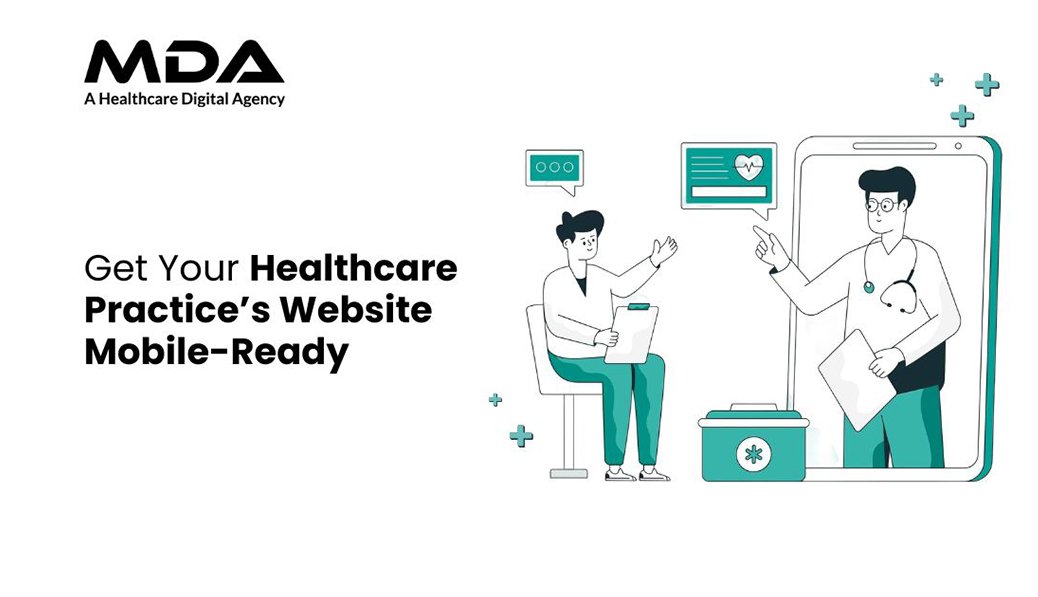
Mobile traffic is by far the most dominating force in healthcare searches today. Patients are researching symptoms, providing provider comparisons, and making appointments from smartphones during their commutes, lunch breaks, and waiting rooms. When your website doesn’t work on mobile devices, you’re losing potential patients who need care right now.
Google gives preference to mobile-responsive websites in search rankings. A website that annoys mobile users falls down the visibility rankings, appointment bookings decline, and your practice’s reputation suffers before patients have even walked through your practice.
Healthcare decision-making occurs on small screens. Patients tap, scroll, and check your credentials based on how fast your site loads and if they easily find your contact details.
A website that is more focused on the desktop is instant friction. Text becomes unreadable. Buttons overlap. Forms break. Patients bounce out of the site within seconds, looking for practices that take their time and time on devices into consideration.
Non-responsive sites are penalized by search engines. Mobile-first indexing means that Google checks your mobile version first. Poor mobile performance means one thing – poor search rankings, less organic traffic, and fewer patient inquiries.
Your competitors invest in mobile optimization. Practices with responsive designs attract patients who would have otherwise passed you by for your services. The gap only gets wider every month as mobile usage continues pushing out desktop browsing.
Responsive design is the automatic way of adapting the layout. Screen sizes range from small pocket-sized smartphones to tablets. Your site should be able to reconfigure content, images, and navigation without the need for separate mobile versions.
Load speed is the determining factor of patient retention. Compress the images without losing quality. Minimize code bloat. Enable browser caching. Every second it delays, it increases bounce rates and lost appointments.
Touch-friendly elements avoid frustrating the user. Buttons should have sufficient spacing. Forms need larger fields of input. Click-to-call functionality should take single taps and not require zooming and mispressing.
Navigation should become simpler for smaller screens. Hamburger menus provide an efficient way of organizing content. Critical information, such as appointment scheduling, contact information, and services, can be no more than two taps away.
Readable content creates an immediate trust. Font size smaller than 16 pixels puts a lot of strain on the eyes of mobile devices. Line spacing and paragraph breaks aid in understanding. High-contrast color schemes make sure that all users can access the content.
Appointment booking is a direct revenue source. Mobile forms should be equipped with autofill functionality, a limited number of mandatory fields, and intuitive submission buttons. Complex multi-step processes lead to abandonment before bookings are completed by patients.
Local search optimization captures local patients. Google Business Profile integration, NAP information that is accurate, and location-specific keywords help your practice come up when patients are looking for care options in your area immediately.
Security signals help to give comfort to worried patients. SSL certificates, HIPAA compliance messaging,g and visible trust badges help to ease the anxiety involved in the exchange of personal health information via mobile devices.
Test and objectively measure current mobile performance. Use Google’s Mobile-Friendly Test and PageSpeed Insights on actual devices. Navigate as patients would – search for services, try to book an appointment, and access contact information.
Prioritize high-impact fixes first. Slow loading times and broken navigation take them away from patient conversions instantly. Deal with these before making cosmetic adjustments or minor content tweaks.
Monitor performance metrics on a regular basis. Track mobile bounce rates, session length, and conversion paths. Compare mobile vs. desktop performance. Identify specific pages or features that lead to the drop-off of patients
Update content to mobile consumption patterns. Patients scan on smartphones at a rapid rate. Use short paragraphs, use bullet points for important information, and use headings that will allow you to retrieve information quickly.
Paid advertising effectiveness is dependent on mobile optimization. Running the best digital marketing service for cardiologists is futile when landing pages don’t work on smartphones. Ad spend only converts when mobile experiences support patient action.
Social media traffic is coming mostly through mobile. Facebook ads paid for doctors offer seamless transitions from ad click to appointment booking maximise return on advertising investment.
Email campaigns reach patients on smartphones. Newsletter links, appointment reminders, and health updates – these get opened on the mobile device. Broken mobile and waste away email marketing budgets and hurt patient relationships.
Many healthcare websites are more focused on aesthetics than they are on functionality. Heavy animations, large video backgrounds, and too many graphics significantly increase loading time on mobile devices. Patients to get information for urgent care cannot wait for the decorative elements to render. Remove unnecessary visual embellishments that waste bandwidth with no benefit to improving patient outcomes.
Pop-ups ruin the mobile user experience. Email capture forms, cookie consent banners, and promotional overlays get in the way of content on small screens. Patients have difficulty completing these interruptions, specifically when close buttons look too small for accurate tapping. Implement pop-ups sparingly, make them easy to dismiss, and never obstruct important information such as emergency contact numbers or scheduling a visit.
Confusing information from mobile and desktop versions is confusing to patients. Some practices accidentally leave out service information, provider credentials, or contact information in mobile websites. Patients changing from one device to another notice discrepancies, which questions the reliability of your practice. Auditing of both versions should be done regularly to check the content and information parity.
Neglecting mobile-specific features is detrimental to conversion opportunities. Desktop sites use hover states for navigation; mobile uses direct touch interaction. Implement swipe gestures for image galleries, sticky headers to have persistent access to booking buttons, and collapsible sections to organize long content efficiently. These mobile-native interactions feel intuitive for patients who are used to smartphone applications.
Accessibility compliance means you reach out and improve your patient reach by a huge margin. Patients with visual impairments, motor limitations, or cognitive differences use assistive technologies. Screen readers, voice commands, and keyboard navigation need to work perfectly on mobile devices. Implement good heading hierarchies, alternative text for images, and good color contrast ratios.
Voice search optimization captures the emerging patient segments. Patients ask healthcare-related questions on smartphones while they are multitasking. Organize content to answer specific queries: “What are office hours for Dr. Smith?” Or “Does the clinic accept my insurance?” Natural Language patterns in your Mobile content make voice search more visible.
Multilingual support expands your patient base.
Healthcare caters to a variety of communities with different language preferences. Mobile sites should detect device language settings and provide content in the patient’s preferred languages. Translation quality is important – medical terminology needs to be translated by professionals and not with translation automation that leads to errors and may, in turn, misinform patients.
Integration of telemedicine requires mobile excellence. Video consultations, digital check-ins, remote monitoring, and more all take place mostly on smartphones. Your mobile website is the gateway to virtual care services. Maintain patient data security during the transition from scheduling appointments to accessing the telehealth platform.
Regular testing avoids gradual deterioration. Operating system updates, new device releases, and browser updates impact mobile performance. Monthly checks detect problems before patients even do.
Content updates are necessary with a view towards mobile display. New service pages, blog posts, and practitioner profiles require mobile optimization from the creation stage. Inconsistent patient experiences are created when we add desktop-only content.
Security patches are used to protect patient data around the clock. SSL certificates need to be renewed. HIPAA compliance evolves. Outdated security on mobile platforms puts your practice at risk of data breaches and regulatory violations.
Performance optimization never ends. Image compression, code minimization, and cache management are areas that need constant attention. Mobile networks improve,e and with this, patient expectations increase in site speed.
Systematically keep track of appointment sources. Identify which patients book using mobile or desktop. Measure the differences in conversion rates. Adapt strategies according to the actual pattern of the patient’s behaviour.
Keep track of changes in search ranking. Compare mobile rankings with competitors monthly. Track the position of keywords for services and locations of interest to your practice.
Analyze user behavior flows. Where do mobile visitors leave their vehicles? Which pages are confusing? What is the most engaging content for patients to stay long? Use these insights to improve mobile experiences on an ongoing basis.
Calculate revenue impact directly. Compare patient acquisition costs from channel to channel. Measure the lifetime value of mobile-acquired patients. Quantify the return on investment of mobile optimization investments.
Basic implementable responsive design takes from two to four weeks. Whole optimization, including speed improvements, form redesigns, and testing across devices, takes six to eight weeks. Continuing to refine as the patient behavior data accumulates.
Yes, significantly. Google is using mobile-first indexing, meaning that they evaluate your mobile site before the desktop versions. Poor mobile performance results in lower rankings on all devices, which leads to a decrease in organic traffic and patient discovery.
Click to call buttons, simplified appointment forms, fast load times, and easy to navigate drive the highest conversions. Within seconds of their arrival, patients abandon sites that lack these essentials.
Separate mobile sites create maintenance complexity and SEO fragmentation. Responsive design offers improved patient experience, simplified content management, and consistent analytics tracking on all devices.
Google Mobile-Friendly Test for technical validation. Test personally on several smartphones and tablets. Navigate as patients do search for services, book times, access contact information, and honestly evaluate the entire process.

C – 81C, Sector – 8, Noida 201301, India


1025 Beamon Drive, Franklin 37064 Tennessee, USA
Sveavagen 34 111 34 Stockholm, Sweden
Copyright ©MDA. All rights reserved.