
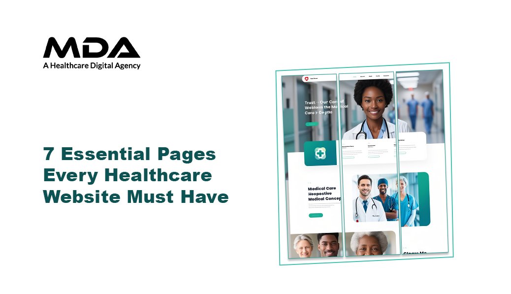
Your healthcare website is the deciding factor for a patient to choose your facility or move on to the next search result. Each second of hesitation is costly for appointments. Each missing page causes friction in a journey that should be effortless.
The difference between a website that converts and a website that hemorrhages prospects isn’t budget or technology. Its structure. The most effective healthcare sites have a common architecture – there are seven core pages that function as a conversion system, rather than isolated content.
These pages do not just provide information. They minimize objections, build credit, and take patients from the unknown to the known. When designed with patient psychology and mobile-first principles in mind, they transform your site to become more than a digital brochure – it becomes your most productive patient acquisition channel.
Your Homepage is facing a brutal evaluation window. Patients scan, make clinical credibility judgments, and make decisions about whether or not to look further — all in seconds.
Effective healthcare homepages provide answers to three immediate questions: What do you treat? Who are you? Why should I entrust you with my health?
What this page must include:
Clear value statement of your specialization without generic statements such as “committed to patient care.”
The homepage establishes expectations for all of the interactions that follow. Confusion here trickles down the entire patient journey. Clarity here creates momentum towards conversion.
Mobile and UX considerations: Most healthcare searches occur on mobile devices, frequently at a time of concern or discomfort. Your homepage needs to load in less than three seconds, tap targets need to be big enough for anxious hands, and hierarchies of content need to work on small screens. Healthcare ui ux design companies focus on making navigation intuitive for people and using a single-column view so that people don’t have to scroll horizontally.
Generic service descriptions lose patients to competitors that explain exactly what happens, why it matters, and what outcomes to expect.
Each service should have a page of its own. Cramming multiple treatments on one page dilutes focus and confuses search engines as to your real expertise.
The qualities that make service pages convert:
Patients come into service pages with questions and objections. Your content either solves them or leaves them for your competitors.
Patients select providers that they trust. Trust begins with competence (credentials, experience, training), but it is cemented in connection (values, approach, team culture).
About pages fall when they resort to corporate mission statements that might describe any healthcare organization. They succeed if they answer the question, ” What is different about your approach? What drives your team? Why did you decide to choose this specialty?
Essential elements:
Do away with the generic “committed to excellence” verbiage. Patients read through it. Specificity helps to build credibility. “Our emergency department treats more than 45,000 patients every year” is more powerful than “we deliver quality emergency care.”
Patients don’t make appointments with facilities. They schedule with people. Provider profiles help to lower the psychological barrier between “researching options” and “committing to care.”
What effective provider pages include:
Design considerations, healthcare mobile app development, and modern web experiences all focus on the retrieval of information quickly. Provider pages should be instantly loaded with scannable sections that answer the question, “Is this doctor right for me?” within seconds.
When a patient makes the decision to reach out, everything that stands between the decision and completion of the contact is lost conversion.
Contact pages need to be easily accessible from all other pages. Visibility of the footer is not sufficient. Consider sticky contact buttons or chat interfaces that do not disappear during scrolling.
Required information:
Patients come to your site with questions. Unanswered questions become obstructions. Objections become derelict sessions.
FAQ pages do more than inform – they are a sign of patient-centricity. They show that you know what common concerns are and are in front of them to take care of them.
High-impact FAQ topics:
Patient resource sections can contain downloadable forms, pre-visit instructions, post-procedure care guidelines, and condition-specific education. Each resource puts your organization in the position of being helpful before the first appointment occurs.
Patient testimonials have more conversion power than anything you say about yourself. Third-party validation from people who’ve been through your care minimizes perceived risk.
Effective testimonial pages don’t end with generic praise. They include specific outcomes, specific staff members, and detailed experiences that help prospects envisage their own care journey.
What makes testimonials believable:
Integrate review platform ratings (Google, Healthgrades) on this page. Link to your profiles for those patients who wish to read more. Consider HIPAA guidelines carefully – always ask for written permission to share stories on patients.
These seven pages are not independent pieces of content. They are a conversion pathway that helps patients through awareness, consideration, and decision stages.
The patient journey mapped:
Each page should take patients logically to the next step. Internal linking, strategic CTA placement, and consistent messaging are used to create momentum, not confusion.
When healthcare ui ux design companies create these page systems, they plot out user flows leading from multiple points of entry (organic search, paid ads, social media) to ensure that every path leads in the direction of conversion without dead ends.
Mobile healthcare pages focus on thumb accessible navigation, single-column designs, and quicker loading using compressed assets. Touch targets need to be bigger (minimum 44×44 pixels) than desktop click targets. Forms require fewer fields and simplified methods of input. Phone numbers should be tapable for instant calls. Healthcare mobile app development standards emphasize these principles because patients often search during moments of discomfort, and patients have a minimum of patience for complex interactions.
HIPAA compliance for websites mainly applies to patient portals, health information collection contact forms, and any system that transmits protected health information (PHI). Publicly viewable pages (services, about, testimonials) don’t fall under HIPAA unless there is patient-specific data in them. Be sure to provide SSL encryption, HIPAA-compliant form tools, offer secure hosting with business associate agreements, and get explicit patient consent to publish testimonials with identifying details. Patient resource pages providing general health information do not need special compliance over and above standard security.
The core seven pages are universal, but specialties should tailor content depth and include specialty-specific pages. Emergency departments require information on clear crisis protocols and wait times. Mental health practices involve confidentiality explanations and telehealth information. Surgical centers take advantage of procedure preparation and recovery timeline pages. The framework is always the same; the content changes in accordance with the needs of the patient and the most common specialty-specific questions.
Blog and resource pages benefit from monthly updates. Core pages (services, about, providers) must be reviewed quarterly for accuracy. Immediately update provider credentials when those credentials change. Testimonials should be refreshed every 3-6 months to highlight current experiences of patients. FAQ sections should be enlarged if staff people are repeatedly answering the same questions. Google rewards fresh, accurate content, but forced updates to unchanged information provide no SEO benefit. Change when content enhances patient experience or changes operations.

C – 81C, Sector – 8, Noida 201301, India


1025 Beamon Drive, Franklin 37064 Tennessee, USA
Sveavagen 34 111 34 Stockholm, Sweden
Copyright ©MDA. All rights reserved.